
By Olivia Bouët-Willaumez
A collector’s object…
—
When Baghera Wines commissioned me for their first auction catalogue (“Burgundies, Whiskies”), my mind went nuts ! The brief spoke of luxury, “a collector’s object”, of something precious — “for keeps”. Every single lot was to be illustrated, there was a map of Vosne-Romanée and Henri Jayer’s coat of arms to be drawn, more than 600 photographs to be taken, attention was to be brought to the slightest detail — 602 lots, 300 pages in total… a real feat. In a (very) limited amount of time — time is precious in the business and it is current to work against the clock…
Ideas and images began to dart around… this was exciting.
The interior layout was defined — we needed it to obey fundamental needs : texts would arrive at the last minute, the photographs didn’t all have the same format, and there would be 600 of everything ! I automatized the layout to the max, but still the need for “human” intervention was needed — there’s always an exception somewhere… It was like sewing a very intricate piece of clothing.
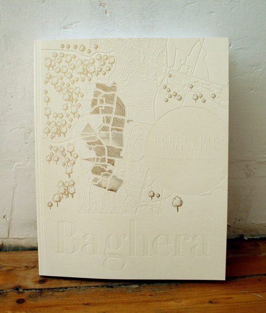
The cover was the other “big thing”…
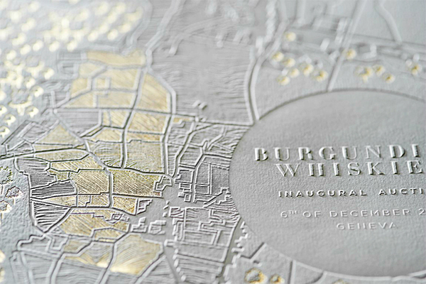
A cover is what an icon is to an Orthodox — the incarnation of the Essence within… But we had 602 “essences” ! How were we to bring together the contents of this wild catalogue under one same banner… What was the common denominator to all the lots within ? And how would we eventually transcribe this unity in graphic terms ?
After long deliberations over what subject to figure on the cover… we finally opted for the map of Vosne-Romanée (which had taken so long to painstakingly re-draw…) because it was Baghera’s first “voyage”, because it was “under our feet” — soil. Origins. The beginning. The “stem”, the “radical”… Nature and Man together. A fundamental story…
But what were the graphic tools going to be ? So many possibilities out there… It was about choosing the right one… What were we trying to say ? The intricate weaving of content and form…
I had imagined something very pure and virginal for this first auction. I could see the paper being left alone, unadulterated, natural and raw : no varnish, no bleach white. “Ivoire naturel”. Henri Jayer, the “Natural”, was a central figure of this first auction : if he didn’t need adjuvants for making the best of wines, neither did we to make the best of covers : no ink ! What technique was left ? Pure embossing. The idea arose quasi logically : as the “vigneron” ploughs his plots, the printer would mark his paper — the cover as a metaphor of the printer’s “plot of land”.
But still we needed to ornate this austerity and stage its counterpart, bringing it to light : ‘twas not only stark, ‘twas also rich and bountiful — there was still to transcribe the fruit, the abundance, the treasures. It was whilst re-reading the introductory texts that gold clearly appeared as the missing link : “… fields of vegetable gold…”, as Emmanuel Mercé wrote in his text on the Whiskies. Gold was the answer ! Gold was the common denominator for the “Côte d’Or” wines and the Whiskies… Gold foil… Klimt’s portrait of Adele Bloch Bauer…
The gold foil found its place on the map, finely enhancing the furrows in the plots of land, ingraining the trees. Light was the third actor, toying with the embossed, sculpted plots, brushing over the shimmering foil. The cover was playing hide and seek, creating sensations. That’s what I’d been looking for.
The whole process was a fabulous synergy of team co-designing. And had it not been for a tremendous desire to aim for novelty and rarity, I’m not sure we could have done it. The ambition of leaving a trace… Togetherness is the key-word.
Last October, on my way back from the printers’ in the outskirts of Lyon, with the first printouts of the cover on my back seat, I drove through the autumnal auriferous Côte d’Or… and for a few bedazzled minutes I felt as if I were driving through the cover itself, a change of scale… an amazingly appeased feeling of completeness. We’d been round the clock.
Catalogue printed by Manufacture d’Histoires Deux-Ponts
Cover embossing and foiling by Malinvaud dorure on Colorplan paper.
Stationery & invitation by Max Métayer, Spind.
* My very special thanks to Stellio Caillat (Deux-Ponts) & Max Métayer (Spind) for their precious help and for being such fantastic partners.